National Grid
Project Overview
Client
National Grid PLC, 2020
Brief
Create a web presence befitting of a FTSE top 20 business
Challenge
National Grid’s web estate was a tangle of disparate designs, layouts, structure and navigation styles, across various microsites. Resulting in the brand feeling disjointed, scattered and lacking a clear sense of who they are. Our goal was to find a way to consolidate National Grid’s websites and microsites into a single, content-centric web architecture, to empower users to quickly and effectively access the information they need.
Solution
A brand uplift, fresh page design and updated navigation patterns across all platforms tied together the entire National Grid web estate, providing much needed consistency across multiple platforms, whilst the introduction of a new splash screen experience would further empower users to successfully find information across the sites.
My role
UX Designer
Methodologies used in my role
Competitive analysis | Heuristic analysis | Website analytics analysis | Empathy maps | User journeys | Experience mapping | Primary user flows | Information architecture | Site maps
Team
Simon Kinslow UI Design
Jan Golding UX Designer
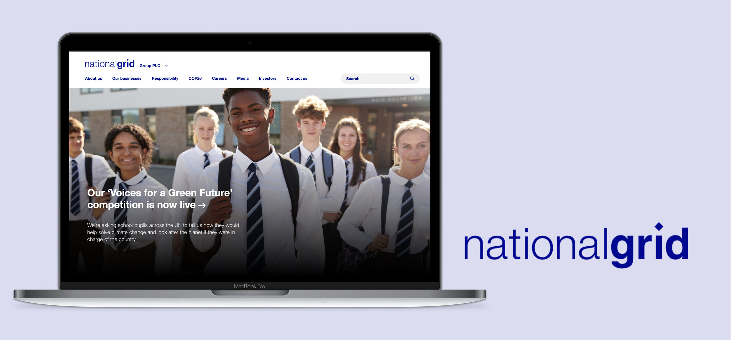
National Grid Website
Journey through the updated navigation system, now live across National Grid’s web estate.
The Project: Getting the Brand Back Together
National Grid’s digital estate, consisting of four enterprise websites and multiple microsites, had long suffered from a lack of governance. The resulting tangle of disparate designs had created a labyrinth of different layouts, structures, and navigation styles across their websites. This was causing the brand to feel disjointed and scattered. Lacking any clear sense of who National Grid are, and the importance of the work they are involved in.
My role in the project was centered around creating user-profiles and subsequent journeys to help drive better design decisions. At the outset of the project I provided competitive research, carried out heuristic analyses of existing sites, and presented best practice recommendations back to National Grid stakeholders. Later I would utilise the secondary research and data analytics available, to produce empathy maps, user journeys, and experience maps, helping to shape a more detailed picture of our user base. These would support the decisions behind my sitemap recommendations and early navigation model concepts, which in turn fed into iterations of the final polished UI designs which can be viewed across the National Grid web estate.
Our Goal: Content-Centric web Architecture and Design
Our goal was to create a web presence befitting of an FTSE top 20 business by consolidating National Grid’s websites and microsites into a single, content-centric web architecture. Together, with a brand uplift and revised and improved navigation that would enable visitors to quickly and effectively access the information they needed on the site.
Our Approach: A Navigation Model Based Around Where Users Want to go
Before a richer understanding of real user needs, issues and journeys could be captured, a great deal of the data available during the early stages of the project consisted primarily of site analytics, internal perspectives and secondary research.
We focused our early designs and navigation flow around perceived user journeys based on existing visitors, assessment of site analytics and applying ‘best practice’ approaches following a large-scale heuristic review across each site. Our aim, to create an updated web architecture with a fresh new look and feel, with slick, standardised navigation and components across the National Grid web estate
A selection of personas from National Grid’s own internal research
User Journeys: Data-Based Audience Members
With such a broad audience, I was conscious to avoid pigeonholing or creating something that was narrowing down the audience too much. To help avoid this, I produced high-level empathy maps and experience maps across the site’s current journeys, to represent the diverse user base.
The website had to be streamlined and easy for anyone to use. From local community members wanting to understand the impact of a project, job seekers seeking opportunities, or energy management professionals visiting the site on a daily basis, National Grid needed to cater for many different use cases.
Experience maps
A selection of empathy maps
Sitemap: Showcasing the Business Whilst Prioritising the User
The goal of the new site map was to make the National Grid Group accessible to users, whilst still presenting those pillars which are integral to the business. The proposed site map shifted away from internal silos to a more user journey-based approach, ensuring a future-proofed architecture that allowed for evolution.
Screenshots of existing and proposed site map work
Navigation: Scaling Back a Confusing and Deep Navigation
Following the heuristic evaluation of the site and a client presentation on best practices in navigation models, it was clear that the existing site had too many options, which was likely leading to mistakes or users picking the wrong option. The site relied too much on the user knowing exactly where they wanted to go.
We tackled this by creating a flexible and consistent navigation pattern to be used across all the sites to reduce cognitive load and human error and scaled back the deep navigation to a maximum of four levels deep to avoid users becoming overwhelmed or lost.
A selection of slides from competitive analysis and navigation client presentations
Early Navigation Sketches
Some of my early navigation model sketches for National Grid
High Fidelity Navigation Concepts
A number of concept navigation designs we explored as part of the project
Navigation Final Designs
Digital Branding Guidance
The refreshed style guide outlining branding guidance for digital applications, components and templates
Final Designs: Consistency, Familiarity and Structure with a Helping of Inspirational Content
The final designs supported actual user goals, shifting away from the preexisting internal silos. Updated navigation patterns featured across all sites on the platform, offering seamless transitions from site to site and some much lacking consistency and familiarity to its users. The implemented brand uplift, fresh page designs and a newly introduced splash screen experience would further help users to successfully access the areas of the site they needed.
A sharper look at content across the site meant we were also able to identify areas on National Grid’s UK site to host aspirational editorial content around the transition to a cleaner energy future. Creating an inspiring and engaging site that can challenge people’s perceptions of National Grid and establish it as an authority and a pioneer in the transition to cleaner, greener energy. Helping audiences understand how fairness and positive societal impact is fundamental to National Grid’s purpose.
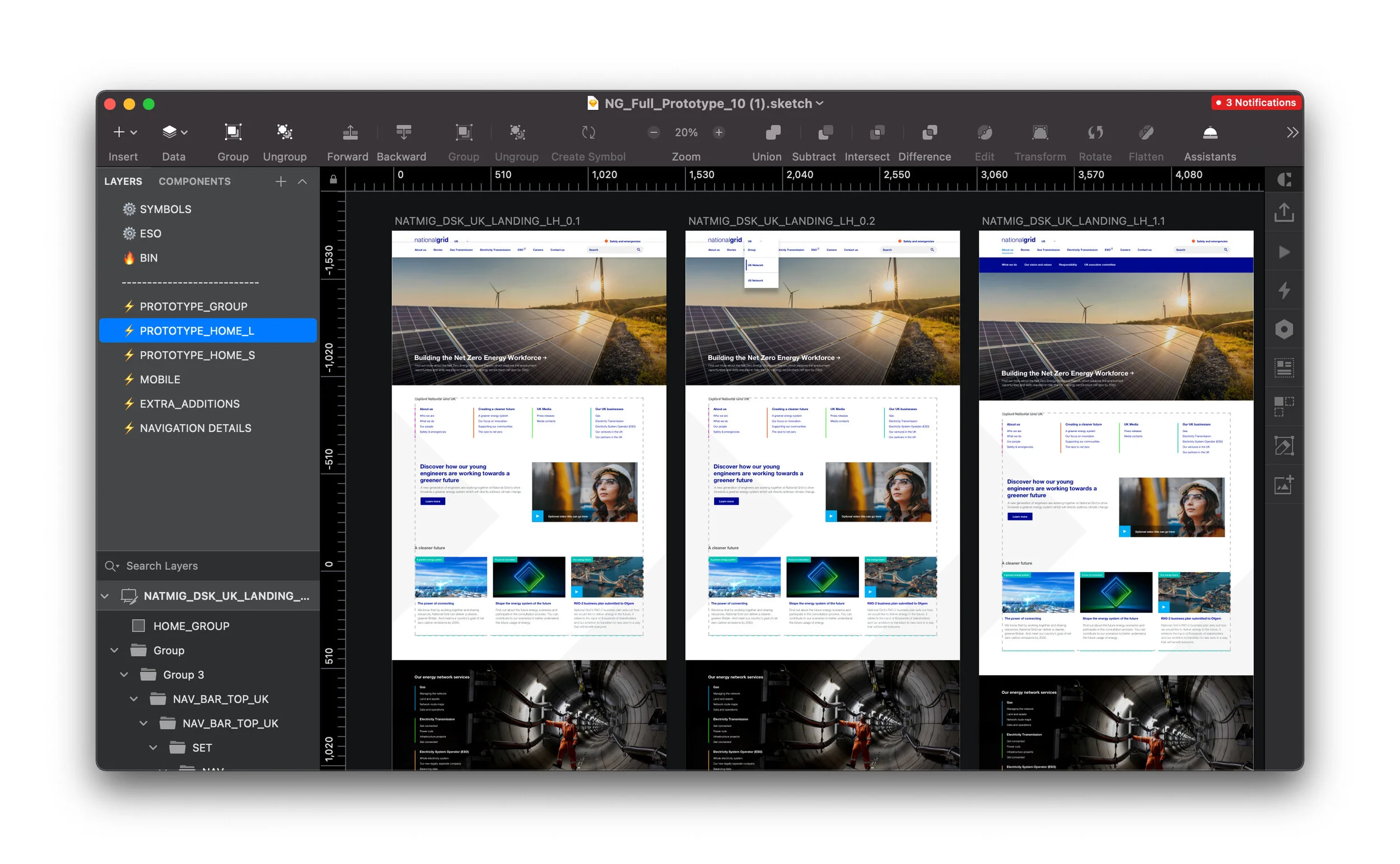
Screen grab of final design work
Screen grab of final mobile design work
Final designs showcasing the ‘group’ and ‘UK’ pages


